
Coastal style does not have to mean buying everything in blue and white. It might begin with the faded pink of a remembered evening, the dark green of distant trees, or the warm gray of a familiar beach path.
A mood board gives those impressions somewhere to gather. Think of it as a conversation with your own taste, not a shopping list or a promise to redecorate. You can finish the afternoon with a page you enjoy and change nothing else.
Your creative afternoon at a glance
- Where: At home, on a clear table or a digital workspace you already use.
- Suggested time: 30–60 minutes, with permission to stop sooner. This is an editorial estimate.
- Cost: Aim for no new purchases. Use your own photos, existing paper, and drawing supplies, or make a digital version without printing.
- Materials: A backing sheet or notebook page, a pencil, optional colored pencils, and your own images or words. Adhesive and scissors are optional.
- Access: Use larger pieces, work seated, dictate color descriptions, or arrange a digital board if cutting and fine detail do not suit you.
1. Choose a place or a feeling, not a trend
Start with a California coastal memory or an imagined atmosphere you can name honestly. Perhaps it is a quiet harbor morning, a sun-warmed walkway, or a foggy afternoon seen through a window.
Write three words for what draws you to it. Try something more personal than “beachy”: weathered, spacious, playful, muted, or bright. Your version does not need to resemble a vacation rental.
If you would like a starting prompt, A Foggy-Day Coastal Ritual: Finding Beauty Without Sunshine offers a three-shade noticing exercise that works from home. A gray palette is as welcome here as a bright one.
2. Start with one image you made
Choose a photograph you took, a drawing you made, or a color note from memory. If you do not have an image, describe the scene in a few sentences and build around those words. For this project, keeping to your own landscape drawings and photos makes the source of your inspiration easy to record.
You do not need to visit the beach or collect natural objects to complete this project. Label an imagined scene or remembered view honestly rather than treating it as a photograph of somewhere you visited.
3. Pull out three colors
Choose one main color, one supporting color, and one small accent. Make swatches with pencils, write the color names, or use a digital tool you already know.
Here are three imaginary starting points, not verified colors from particular destinations:
- Fog and drift: pale gray, muted blue, and warm brown.
- Harbor afternoon: deep blue, cream, and a small orange accent.
- Evening shoreline: dusty pink, slate, and sand-colored beige.
Change any combination that does not feel like you. Your coastal board can include dark colors, unexpected contrasts, or no blue at all.
4. Suggest texture without buying samples
Draw parallel lines for a woven impression, soft shading for a misty surface, or rough marks for weathered wood. You can also write a word such as smooth, faded, or rippled.
If you already have clean paper scraps or suitable fabric offcuts, arrange a few. Do not cut up a useful item just to create a sample. A drawn texture is enough, and you can keep the layout loose rather than attaching everything permanently.
A Coastal Sketchbook Afternoon for Beginners includes simple line and texture exercises. Borrow one for your board without needing to finish a separate drawing session.
5. Leave some empty space
Place your main image first, add the three color notes, then choose one or two texture ideas. Stop before filling every corner. Move the pieces around and notice which arrangement gives the image room to breathe.
If the board feels confused, remove something before adding more. This is a small exercise in choosing, not a test of how much inspiration you can collect.
6. Add one detail from your actual home
Look around for an object you already enjoy: a mug, book cover, cushion, or framed photograph. Does it connect with one of the colors or textures? Write its name on your board rather than moving everything around at once.
The connection may show you that some of the atmosphere you want is already present. If nothing fits, that is useful information too. You are allowed to enjoy a palette on paper without bringing it into your room.
Turn the board into one small experiment
Choose a reversible action: group two objects you own, move your own photograph to a different shelf, or try a different notebook cover for the week. Respect practical needs such as stable placement, clear walkways, and household accessibility.
Do not turn a color exercise into an unplanned repair or painting job. Material selection, surface preparation, ventilation, and product instructions belong to a separate project.
If children want to join
Offer suitable large paper pieces or invite them to name colors while an adult manages tools and materials. Keep small parts, sharp tools, and unsuitable adhesives out of reach. A child’s separate page can be wonderfully different from yours; it does not have to match the room.
A note on environmental language
Using existing supplies is the starting point for avoiding unnecessary purchases in this activity, not evidence of a measured environmental saving. This guide has not assessed any product’s materials, manufacturing, or disposal options.
If you later shop from the board, check the actual product information rather than treating “coastal,” “natural,” or “eco” as evidence of a particular benefit.
About this guide
This is an original editorial creative activity, not a professional interior-design specification or a personally tested workshop. Timing and palette suggestions are illustrative. It makes no claim that a particular color scheme improves wellbeing or that a material is environmentally preferable. No purchase is required, and no specific California destination is represented as the source of the sample palettes.
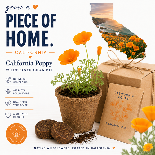
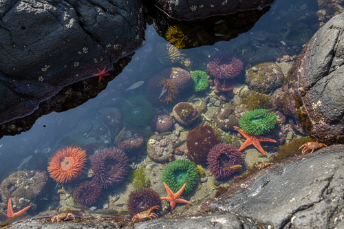
The featured image is an imagined mood-board illustration, not a documented workshop, real destination photograph, product bundle, or downloadable template.
Your next step: choose one image you made, write three words for its atmosphere, and find three colors. Let the board be useful before asking it to become anything more.